The website of Overdone, the Web3 studio I have worked at since 2023. A website case, separate from the products we build there, like Duel Duck.
What I did
Rethought four parts of the home page (hero, services, team, footer) and designed a new recruiting page, keeping the studio’s visual language.
Result
Live at overdone.it. Visitors see what the studio does and its open roles before scrolling, and hiring now has a page of its own.
RoleProduct Designer
ScopeRethink · Improve · Add New
Timeline2025
From a site that worked to one that grows
When I picked it up in 2025, overdone.it already worked. The studio had outgrown it: more work to show, open roles with no page of their own, and parts of the home page that said little about the studio itself.
1
What does the studio do?
“Simplifying complexity” could have been any studio. The first screen had to name the work.
2
How do you show it, not claim it?
Four competencies were listed and none were shown.
3
Where do the open roles live?
Two vacancies sat buried in a block about the team.
4
Does it read as a company?
The footer held one call booking and two social links, not much to sign a contract on.
One rule
Keep the existing visual language, so the new site still felt unmistakably Overdone. The structure could change; the look stayed.
Solution
Four parts of the home page were rethought, and one page was added. Drag the handle on each screen to compare before and after.
Rethought
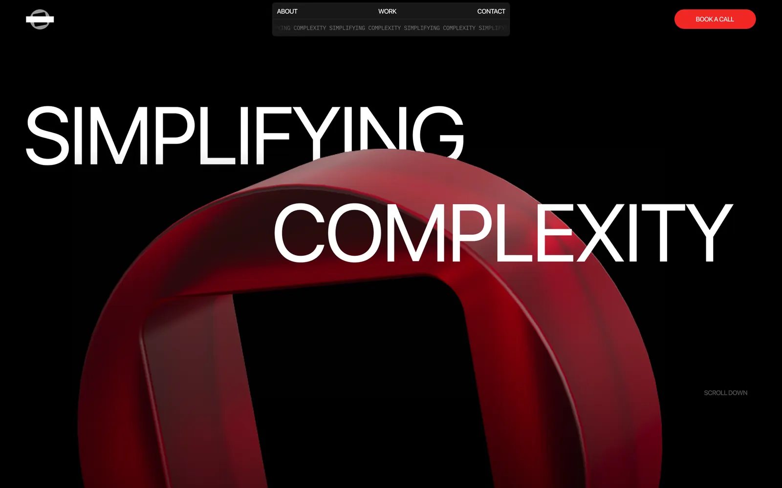
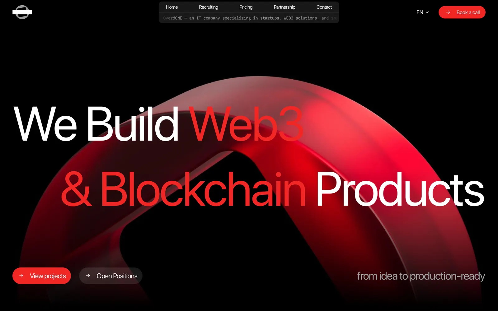
Hero“Simplifying complexity” could have been any studio. The first screen now names the work, and puts both things visitors come for, the projects and the open roles, within reach before any scrolling.
BeforeAfter
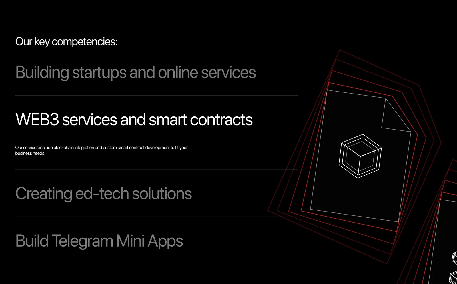
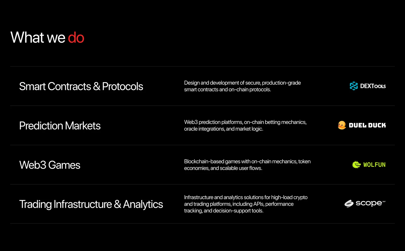
What we doFour competencies were claimed and none were shown. Every service now carries what it covers and the client it was built for, so the page argues with evidence instead of adjectives.
BeforeAfter
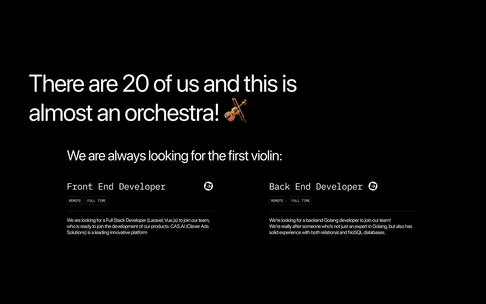
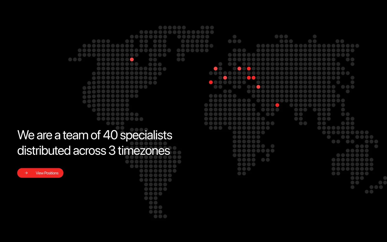
TeamA joke about an orchestra told a visitor nothing, and two vacancies sat buried in a block about the team. The size and the spread are now stated plainly, forty people across three timezones, and hiring has a page of its own.
BeforeAfter
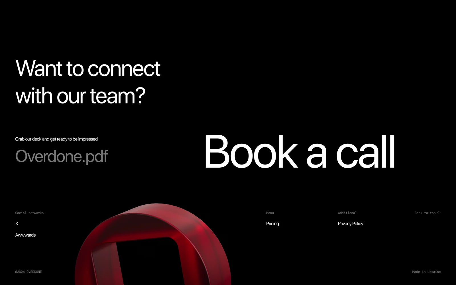
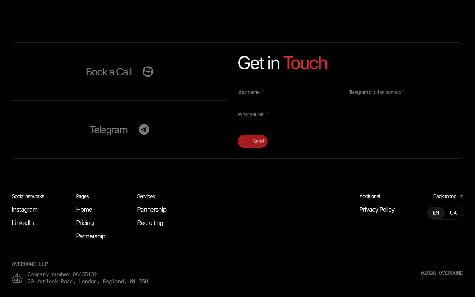
FooterThe foot of the page held one oversized call booking and two social links. It now carries a form, the full sitemap, a language switch and the registered company details: what makes a studio read as a company you can sign a contract with.
BeforeAfter
Added
A dedicated page for roles, rates and the hiring process.
overdone.it/recruitingLive
Branding
The structure changed, but the visual language stayed.
Logo
Aa
SF Pro Display — display & UI IBM Plex Mono — labels & numbers
 Logo

 Pécs Visitor Guide
See the case