A city guide app for Pécs, Hungary. Visitors scan a QR code at each stop to read or listen to the story behind it.
What I did
Designed it end to end and built it myself in Flutter: a scan-first flow, larger text, audio and a language switch always in reach.
Result
Live on iOS and Android since 2020, 5K+ Google Play downloads, and still used on location in 2026.
RoleProduct Designer, Flutter Dev
ScopeMobile App
Timeline2020
From a QR sign to the story behind it
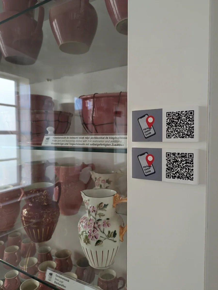
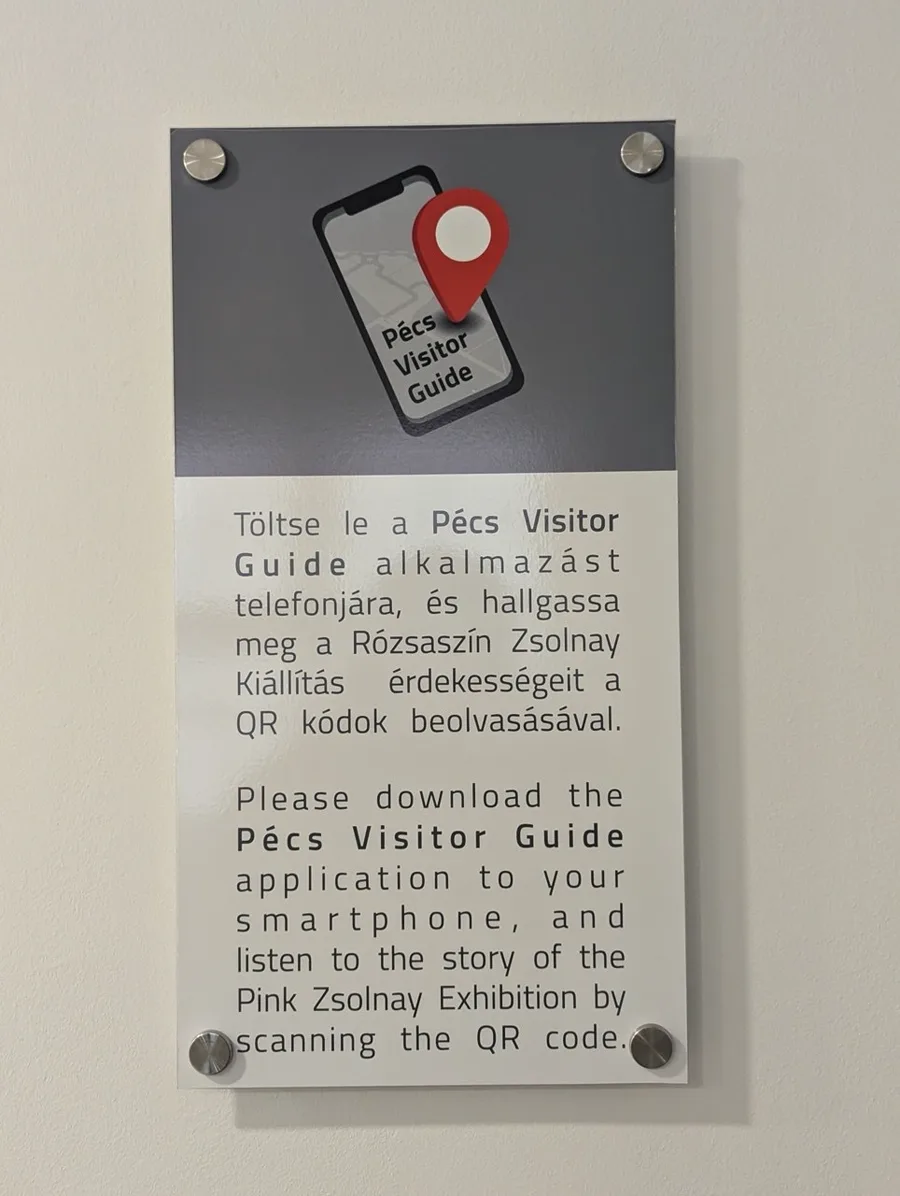
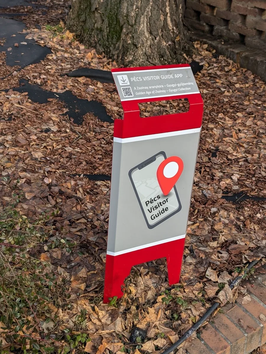
In 2020 I designed and built a guide for the Zsolnay Quarter in Pécs with Intelliweb. Each stop in the quarter has a QR sign, and the app had to turn that sign into the story behind it, read or heard, in the visitor’s own language.
1
How do you get to the story fast?
Scanning had to come first, not sit inside a menu.
2
Can everyone read it?
Text had to be easy to read, and larger when needed.
3
How do eyes stay on the place?
Visitors came to look around, not to stare at a screen.
4
Which language?
Not every visitor reads Hungarian, so switching had to be always in reach.
The visitor’s path
1
Arrive
Reach a place or exhibition
2
Scan
Scan the QR code at the location
3
Read / Listen
Learn more about what’s in front of you
4
Continue
Move on to the next stop
Constraints
Time
Short sprints
Every part had a sprint and a fixed deadline.
Brief
A clear request
The client knew what the app had to include.
Team
One person, design and code
I designed the app and built it myself in Flutter.
Early decisions
Build
One codebase
Flutter for iOS and Android, so both apps could ship within the same sprints.
Flow
Scan first
The QR scanner as the way into every story, not an item in a menu.
Look
Photos lead
A white interface, so the pictures of the exhibition carry each screen.
Simple by design
Scan stays centralThe QR scanner is always easy to reach.
Readable when neededText can be enlarged for better accessibility.
Listen while exploringAudio lets visitors keep looking around instead of staying on the screen.
Switch language easilyLanguage controls are always within reach.
Branding
Almost every screen is a photograph of the exhibition. The interface stays white and lets the pictures carry it, and one colour is kept for the thing the visitor actually came to do.
Logo
Aa
Roboto Roboto Condensed
Type
00ADEFB41F3F231F20Colour
Still part of the visit
Years after launch, the app is still used in the same places it was designed for.
2020Designed
5K+Google Play downloads
2026Still in use
What aged well. What I’d change.
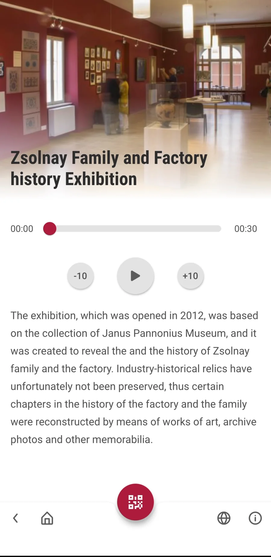
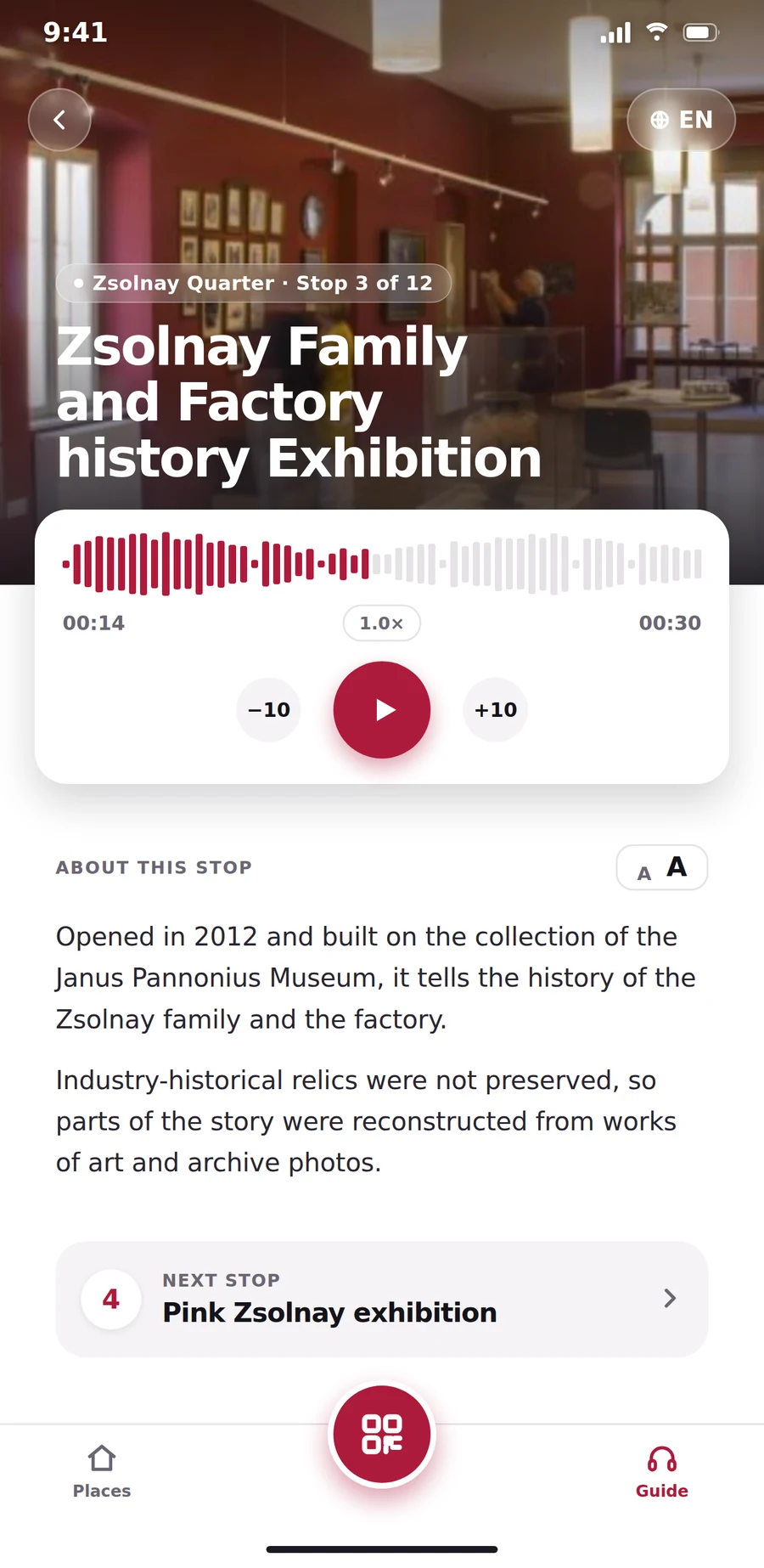
There are details I’d change today to meet modern standards, but the app is simple enough that I’d still call it timeless. On the right is my reimagined screen; on the left, the live app.
 Logo
 Duel Duck
See the case